BoredomBusted — Find Your Next Favorite Thing To Do
Discover hobbies, activities, places, and ideas that spark joy. Whether you're looking for something creative, active, social, or relaxing, BoredomBusted helps you find your next favorite thing to do.
Browse our hobby guides, things-to-do collections, and place ideas to never be bored again.
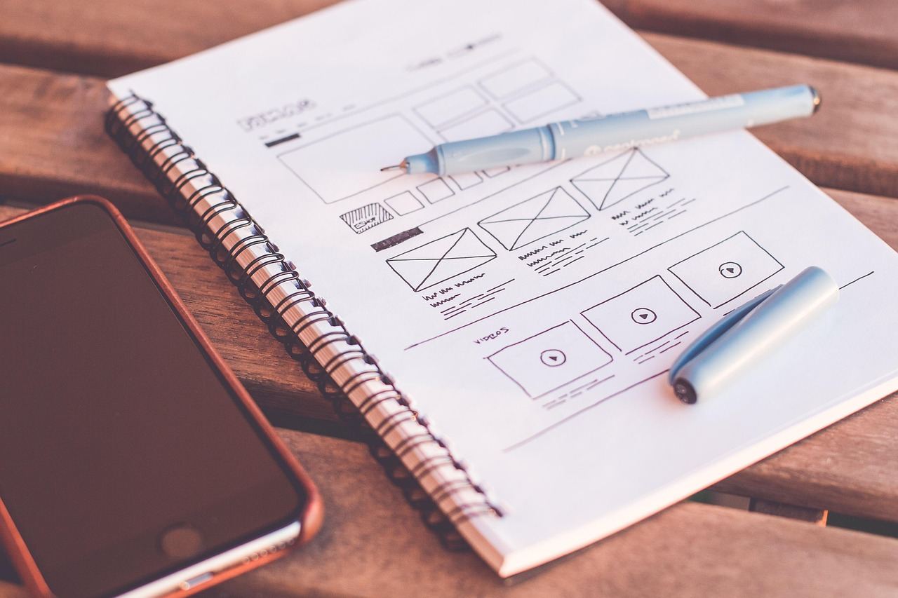
UI design isn't about aesthetics; it's engineers navigating eye movement and instincts to boost task completion — think less about pretty pixels and more about user flow.
Learning UI design as a beginner involves understanding the fundamental elements that dictate how digital interfaces look and behave – buttons, layouts, type, color, spacing, all of it.
You're solving a visual puzzle with real constraints.
Unlike graphic design, every choice has to work interactively, not just sit pretty on a page.
In UI design, you open software like Figma or Sketch to create digital mockups, selecting and manipulating design elements such as buttons and typography while experimenting with layouts and color schemes, often completing tasks in short bursts to iterate on ideas and gather insights.
UI design fosters a flow state through rapid feedback loops, where immediate visual results from small design tweaks keep engagement high, while the satisfaction of completing mockups and exploring creative concepts provides a sense of accomplishment and boosts confidence.
You think UI design is about making things pretty. Pick nice fonts, choose a color palette, maybe add some rounded corners — done.
That assumption will stall you before you ship a single screen.
Every visual decision is a behavioral decision. Where your eye lands first, what you tap next, whether you trust a button — that's all engineered, not decorated.
The gap between a "pretty" interface and a working one is whether users complete a task without thinking. Aesthetics support that goal. They don't replace it.
UI design sits at the intersection of psychology, communication, and systems thinking — none of which require you to be artistic.
You're already picturing a mood board and a color wheel. Understandable.
Here's what actually happens in a real UI session: a designer stares at a checkout form and asks why users keep abandoning it at step two.
They move one field. Reorder two buttons. Completion rates jump.
No new colors. No new fonts. Just a clearer path through the decision.
That's the job.
Getting good at it means learning how people actually read a screen — and a handful of core principles will permanently change how you see every interface you've ever used.
Watching UI design tutorials feels effortless. Someone moves shapes around, picks colors, and suddenly it looks like an app you'd actually use. Then you open Figma and the canvas is blank and enormous and nothing you make looks like anything.
The first week, you spend most of your time inside menus — not actually designing anything. Week two, your first layout exists. It looks like a 2009 app, and that's fine, because now you have something to fix.
By week three, you start noticing the difference between aligned and optically aligned. It quietly ruins every bad interface you've ever used — and you can't unsee it. Week four is when components stop being a concept and start living in your hands, the way a keyboard shortcut finally stops feeling like a trick.
Before you sit down for session one, skip the blank canvas. Pick an app you use daily, screenshot one screen, and rebuild it in Figma element by element. Don't design from scratch — reverse-engineer something real.
Ugly. Slow. Annoying. It's not a warmup exercise — it's the fastest way to understand why every decision on that screen was made. That's the actual skill you're building. The next section covers the mistakes that keep people from building it.
When to start: Morning
Duration: 1 hour
Cost to try: $0
Success criteria: If you turn 2 inspirations into a labeled wireframe for one screen with aligned headers, buttons, and spacing, do session 2.
New designers want to create, not copy — so they skip the research phase entirely. That instinct kills progress fast.
Pull apart three apps you use daily before you open a blank canvas. Screenshot them, annotate what each element does, and treat that annotation session as your actual first design exercise — not a delay before the real work.
Picking fonts feels creative, so beginners treat every typeface as an opportunity. The result is four fonts fighting each other on a single screen.
Limit yourself to two fonts maximum — one for headings, one for body. Use weight and size to create hierarchy instead of reaching for a third typeface.
Most beginners treat spacing like decoration — something to adjust after the real design is done. By then, everything is locked in wrong.
Set a base spacing unit of 8px before you place a single element. Then build every margin and padding in multiples of it. Consistent spacing is what makes amateur work look professional.
It's tempting to make buttons minimal and sleek. But minimal often means invisible to an actual user.
Your button needs a fill color, at least 44px of height, and enough contrast that someone squinting at a phone screen can still find it. If you have to explain to a tester where to tap, the button has already failed.
One beautiful screen feels like progress. It's not — nobody uses an app one screen at a time.
Pick one simple task — signing up or adding an item — and design every screen a user would touch to complete it. A single completed flow teaches you more than ten isolated screens ever will.
UI design is practiced wherever you have a screen – home setups dominate, but coworking spaces and maker spaces host dedicated design communities worth knowing about.
There's no single national governing body for UI design the way there is for a sport – the UXPA (User Experience Professionals Association) is the closest, running local chapters in most major cities and hosting events open to newcomers.
Walk in and say: "I'm just getting started – I've been working through practice briefs and want feedback on my process."
That framing gets you a mentor, not a polite nod – experienced designers respond to people who are already doing the work, not just thinking about starting.
Everything is smaller, touch-based, and thumb-driven. Nearly every design decision changes because of it.
This is the best starting point for most beginners — the constraints force clarity, and most free tools default to mobile frames out of the box.
More screen real estate, more complexity, and you're designing for cursors instead of fingers. The freedom is real, and so is the rope.
It's a strong fit if you want to see your work live fast — a basic website is easier to publish than a mobile app, and the feedback loop keeps you motivated.
Heads-up displays, inventory screens, health bars — UI layered on top of fast-moving, visually loud environments. The design has to work without ever slowing the player down.
Gamers have a real head start here — strong instincts about what feels right mid-session are worth more than a design textbook in this track.
Instead of designing individual screens, you're building the reusable components other designers pull from. Buttons, tokens, spacing rules — the infrastructure of a product.
This is where mid-level designers go to become indispensable. But don't start here — you need a few shipped projects first or the abstractions won't make sense.
No visuals. You're designing dialogue flows, prompts, and responses instead of buttons and layouts. The output is conversation, not screens.
If you have a writing or linguistics background, the skill floor here is different from visual UI — not lower, just built from different instincts.
Some of the same instincts show up in Logo Design — worth a look if this clicked.
For something adjacent, see Short Film Making.
Most beginners spend months tweaking colors and fonts – optimizing the surface when the structure underneath is broken. They're decorating a house with bad architecture.
The one skill is visual hierarchy through contrast management – specifically, learning to control the "weight" of every element so the user's eye has one clear path through a screen, not five competing ones. It's not about making things pretty. It's about making decisions: this is loud, this is quiet, this is invisible.
When you can control visual weight deliberately, you stop designing screens and start designing attention – which is the actual job. Without it, every UI you make looks "off" but you can't say why, so you keep adding drop shadows until something accidentally works.
Eight sessions over 30 days — roughly two per week. That's enough time to move past the "where do I even click" phase and into something that actually tells you whether this fits how you think.
UI design has a deceptive learning curve. The tools feel approachable on day one, then suddenly overwhelming on day three. Most people quit exactly in that dip — before the work starts showing them anything real about themselves.
If you keep opening Figma when nothing is requiring you to, that's the signal. Maybe you're redesigning an app you use daily just because the button placement bothered you. That's not casual curiosity — that's evidence you think in systems, and this hobby has real legs for you.
If you finished all eight sessions and felt nothing either way, that's not a verdict yet. Mobile apps feel different from dashboard design, which feels different from design systems work. Try four more sessions with a completely different project type before you decide.
If you dreaded sitting down every single time, that's a clean answer. Moving boxes around without caring why isn't beginner frustration — it's a values mismatch. More sessions won't change that.
You open an app and immediately clock what's wrong — the button placement, the inconsistent spacing, the reason you tapped twice when once should have worked. If that's already happening without effort, you're not starting from zero.
Most people who end up loving UI design realize they were critiquing interfaces long before they knew what to call it.
If you need physical or immediate feedback to stay engaged, screen-based design will drain you. There's no tactile result, no audience response, no finish line you can touch. The reward is almost entirely internal, and that's genuinely not for everyone.
If your schedule doesn't allow for focused, uninterrupted blocks — even 45 minutes — the work degrades fast. UI design punishes context-switching harder than most hobbies do. A distracted session often leaves you worse off than no session.
If you have significant vision impairment affecting color or fine detail perception, accessibility tools can help close some gaps — but the core feedback loop of the work becomes genuinely harder to close, not just inconvenient.
UI Design is a deeper commitment than most boredom cures — for lighter options, check things to do when bored.
Popular beginner-friendly tools include Figma (free tier available), Adobe XD, Sketch, and even free alternatives like Penpot. Most of these platforms offer cloud-based design with tutorials built in, so you can start designing immediately without major software costs.
You can grasp fundamental UI design principles in 4–8 weeks with consistent practice, including color theory, typography, and layout basics. Building practical portfolio projects typically takes several months before you're ready for freelance or entry-level roles.
UI design is very learnable for beginners—it's more about understanding user needs and applying proven design principles than artistic talent. Most learners pick up core concepts within a few weeks through online courses and hands-on practice.
UI (User Interface) focuses on how a product looks and functions visually—buttons, colors, layouts; UX (User Experience) focuses on the overall journey and how users feel using the product. UI designers create the interface, while UX designers research and define how it should work.
Yes, absolutely—many successful UI designers are self-taught and hired based on portfolio quality rather than credentials. Building 3–5 strong portfolio projects demonstrating your design process is far more valuable than formal education.
Free resources like YouTube tutorials and Figma's learning materials exist, while structured courses range from $30–$300 on platforms like Udemy, Skillshare, or Interaction Design Foundation. Bootcamp-style programs can cost $1,000–$15,000 but offer intensive, job-focused training.