BoredomBusted — Find Your Next Favorite Thing To Do
Discover hobbies, activities, places, and ideas that spark joy. Whether you're looking for something creative, active, social, or relaxing, BoredomBusted helps you find your next favorite thing to do.
Browse our hobby guides, things-to-do collections, and place ideas to never be bored again.
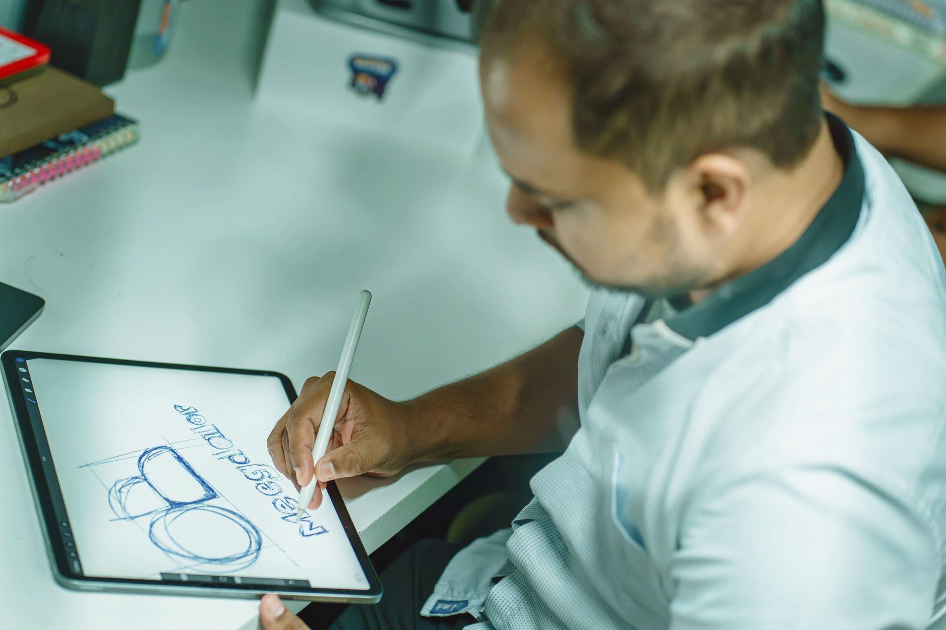
Logos aren't just pretty images; they're complex symbols where every detail serves a purpose, like the hidden FedEx arrow that embodies deeper meaning.
Learning logo design as a beginner involves understanding how to create impactful visual marks that effectively represent a brand or idea at a glance.
You sketch concepts, refine them digitally, and test how they hold up across sizes and contexts.
Unlike general illustration or graphic design, every decision here serves recognition over expression – the constraint is the whole point.
In logo design, hobbyists engage in iterative sketching, brainstorming, and refining visual ideas using simple tools like paper, pencils, or digital software, often beginning by selecting personal passions and associating symbols and feelings with them, followed by creating thumbnail sketches to explore shapes and concepts without the pressure of perfection.
Logo design fosters a flow state through balanced challenges like rapid sketching, allowing for incremental skill feedback as hobbyists refine their designs and creatively express personal passions, leading to a sense of accomplishment when selecting final sketches for potential real-world application.
You think logo design is about making something look good. Pick some colors, choose a font, maybe sketch a shape – done. That assumption is exactly why most first logos feel hollow even when they're technically clean.
A logo is more than decoration – it compresses meaning. Every shape, weight, and color choice either signals something specific or creates noise.
Consider the FedEx logo. There's an arrow hidden in the negative space between the E and the x. Once you see it, you can't unsee it. That wasn't a happy accident. It was a deliberate decision to make the mark do more than one job at the same time.
You're realizing this is more technical than expected. That's what makes it a real skill worth picking up, not just an afternoon distraction.
The next question is what tools and starting points actually make sense for a beginner. That's where most people waste the first month.
Opening Illustrator after watching a sleek tutorial is eye-opening. Confidence quickly fades as you struggle to locate the pen tool, spending 45 minutes on what seemed like a 10-minute task.
The transition from watching to doing is where many give up. The software isn't the easy part – it's the stumbling block in week one. Experienced users make it look simple, but your first attempts rarely match your expectations.
By the second week, you might successfully follow a tutorial but learn nothing about the why behind it. Copying is deceptive; it feels like progress, but actual understanding remains elusive. Real insight comes from creating and failing on your own.
Somewhere around the third week, a small breakthrough happens. Maybe it's understanding spacing or color harmony. It's this tiny success that nudges you forward, making the frustration strangely rewarding. Every failed attempt is a lesson you can't gain by just watching tutorials.
Start designing in black and white. Color can mask poor shapes, so ensure every element works in monochrome first. Skipping this step means weeks lost decorating flaws rather than fixing them. Let's explore common mistakes next.
When to start: Early morning
Duration: 1.5 hours
Cost to try: $0
Success criteria: If you can sketch 3 distinct logo concepts and turn 1 into a simple, legible digital mark in black and white, do session 2.
Color feels exciting and makes the logo seem "done" faster. But it often distracts from the real issue.
Start every logo in black and white only; if it doesn't read clearly there, color won't save it.
Throwing in multiple fonts happens when you don't trust the design. But it makes everything look like a ransom note.
Pick one font family and use weight contrast (light vs. bold) to create hierarchy instead.
Intricate lines impress at full screen but turn into a blob when shrunk. Tiny details just don't scale.
After each draft, shrink it to 1 inch wide and check whether every element still reads.
Without a brief, personal taste takes over. Often, that has nothing to do with the client's audience.
Write down the brand's industry, target customer, and two or three adjectives before opening any software.
A single option forces a yes or no answer. "No" traps you with nowhere to go.
Always present three distinct directions so feedback becomes a conversation about preference, not rejection.
Logo design thrives in versatile spaces. Your home desk, a coffee shop, or a coworking space can all be your studio.
Library quiet rooms are perfect for undistracted sessions.
Start with Meetup.com and search for "logo design" or "graphic design" sessions in your city. Local groups host monthly events and live critique nights.
Facebook Groups are a treasure. Type in "[your city] designers" for active local communities sharing the same journey.
Visit AIGA.org to find local AIGA chapters. They host workshops and portfolio nights, welcoming beginners with open arms.
Discord is where distance disappears. Try "Designers Guild" or "Graphic Design" for daily critiques from anywhere.
The national body for design is AIGA. Visit a local chapter, say you're new, and seek feedback. You'll walk away with critique and useful resource tips.
You're crafting the design using only letters. No icons or symbols, just the name itself. With font choice, spacing, and letterform tweaks, beginners have nowhere to hide, making this the most straightforward start.
Choosing one or two initials to stand alone is deceptively simple. The constraints make it tough. Ideal for those who know how to work with negative space and proportion.
Abstract marks like the Nike swoosh or Apple apple require skill without using text. Start here only if you love distilling meaning into a single shape.
Combine a wordmark with an icon. They're designed to function both together and apart. Learn this to create logos suitable for multiple contexts.
In a badge design, the logo and text are locked in a shape, like those on vintage sports team logos. Popular and often requested, it requires a patience for detail and mastery of hierarchy.
Another variant that pulls from the same roots is Fashion Photography.
For something adjacent, see AI Video Creation.
If you want a related angle, Cartoon Drawing is the natural next stop.
Learn to control visual weight—how the eye perceives heaviness in design elements.
Beginners often fixate on fonts, thinking they'll solve why a design feels off. But it's about understanding the pull and heft of shapes within your composition.
Visual weight is what you're truly adjusting. Balance isn't symmetry; it's how the elements interact, such as a bold icon beside a thin wordmark.
Logos that used to take 40 frustrated iterations start resolving in 5. When you sense the weight without yet identifying the issue, you move from guessing to diagnosing. You'll quit adjusting kerning when the actual flaw lies in icon size or contrast differences.
Eight sessions in 30 days. Two sessions per week is your baseline to gauge interest in logo design.
You find yourself using design software outside of scheduled times and sketching on napkins. You're noticing logos on everyday objects and considering their effectiveness. It's not accidental—design is now interesting, not just effortful. Focus on one design principle weekly to deepen your skills and see where it takes you.
You finished eight sessions but lacked strong feelings. This is often mild avoidance masking as neutrality. Reflect on whether you connected with your projects or just followed tutorials. Try another month with a focused project, like a local business rebrand. This could reveal more than generic exercises ever could.
You dreaded opening the design files every time. Don't dismiss this feeling. Disliking the iterative nature of design is telling. Logo design requires appreciation for refining work, beyond just finishing tasks.
When you constantly photograph only the type on signs, menus, and storefronts, take note. It indicates an underlying attraction to letterforms and marks, essential for logo design.
Want broader ideas first? Our list of hobbies gives you the lay of the land.
Not ready to pick a hobby yet? The boredom busters page has smaller things to try first.
Popular options include Adobe Illustrator, CorelDRAW, and Affinity Designer for professional work, but beginners can also start with free tools like Canva, Inkscape, or Figma. The best choice depends on your budget and learning preferences—many professionals recommend Adobe Illustrator, though it requires a subscription.
A simple logo can take 2–4 hours if you have basic design skills, but a polished, professional-quality logo typically requires 8–20 hours including research, sketching, and revisions. The timeline depends on your experience level, complexity requirements, and how many design iterations the client requests.
No prior experience is necessary—many successful logo designers started as beginners by learning design principles, color theory, and typography through online courses and practice. However, you'll need to invest time in learning software fundamentals and studying existing logos to develop an eye for good design.
Beginner logo designers typically charge $50–$300 per project, while experienced designers charge $500–$3,000+, depending on complexity and client budget. You can start freelancing on platforms like Fiverr, Upwork, or 99designs to build a portfolio and gradually increase rates as you gain experience.
A logo is a single graphic mark that represents a brand, while brand identity encompasses the entire visual system including colors, typography, imagery, and design guidelines. Logo design is the starting point of brand identity—creating one memorability symbol, while brand identity extends to how that symbol works across all touchpoints.
Start with online courses on platforms like Skillshare, Udemy, or YouTube that teach design principles, color theory, and typography. Combine learning with practice: study iconic logos, recreate them to understand techniques, and create your own designs based on real or imaginary briefs.