BoredomBusted — Find Your Next Favorite Thing To Do
Discover hobbies, activities, places, and ideas that spark joy. Whether you're looking for something creative, active, social, or relaxing, BoredomBusted helps you find your next favorite thing to do.
Browse our hobby guides, things-to-do collections, and place ideas to never be bored again.
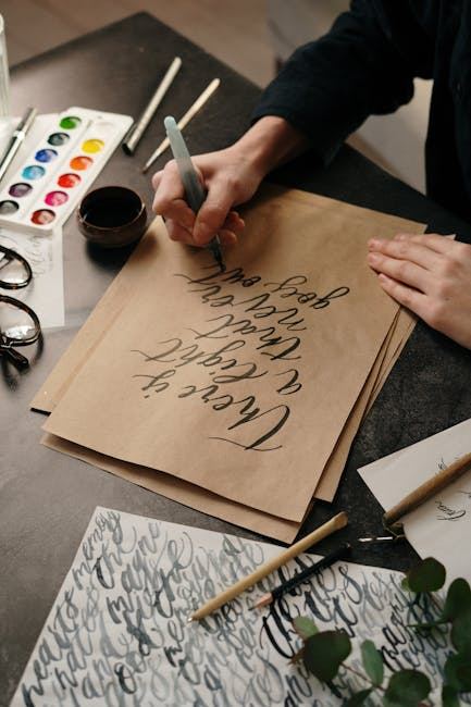
Discover the art of calligraphy with our beginner's guide, designed for all skill levels. Explore essential techniques, tools, and tips to create elegant lettering and express your creativity. Unleash your potential and transform words into beautiful art with practice and dedication.
Most people think calligraphy is just fancy handwriting. It's not. It's a discipline built on pressure, angle, and timing — and the gap between a beginner's first attempts and something that actually looks good is smaller than you'd expect, as long as you understand what you're actually trying to control.
The frustrating part isn't the letters. It's that nobody tells you the three things your hand, tool, and paper are doing simultaneously every time you make a single stroke. Once you see it that way, everything clicks faster.
Every stroke in calligraphy is the result of three things working together: tool angle, hand pressure, and stroke direction. Change any one of them mid-stroke and the line falls apart. That's not a flaw — that's the whole game.
Contrast (thick and thin lines) is what makes calligraphy look like calligraphy. A pointed pen creates contrast through pressure — push down and the nib spreads, creating a thick stroke; release and you get a hair-thin line. A broad-edge nib creates contrast through angle — the same stroke changes width depending on where it sits relative to the nib edge.
Consistent letterform structure means every style has an underlying skeleton — proportions, slant angle, and x-height that hold letters together visually. Before you worry about beauty, you're training consistency. Ugly-but-consistent beats pretty-but-chaotic every time.
Rhythm and flow give good calligraphy its tempo. Strokes are made with deliberate speed — not rushed, not agonizingly slow. That rhythm is what stops letters from looking labored, even when each one technically took three seconds.
Most beginners skip straight to letters. That's the mistake. A structured first session follows a specific sequence — and if you follow it, you'll end your first hour with something that actually looks intentional.
Set up your workspace properly before you open any ink. Good light from the left (for right-handers), a smooth surface under your paper, and ink within reach without being a spill risk. Your forearm should rest on the desk, not float.
Find your pen angle before a single letter. For pointed pen styles, the pen sits at roughly 45–55 degrees to the page. For broad-edge styles, nib angle to the baseline determines everything. Practice holding that angle consistently on blank paper before ink touches it.
Drill basic strokes for at least 15 minutes. Upstrokes, downstrokes, ovals, and compound curves. These are the atoms every letter is built from. Fill at least one page before touching a letterform. This part is boring and completely non-negotiable.
Start with five letters, not twenty-six. Pick the simplest letterforms in your chosen style — usually i, n, u, a, and o. Write each one twenty times. You're looking for the moment your hand stops thinking and starts remembering.
End by writing one complete word slowly. Something short — your name, or a three-letter word. Don't aim for perfection. Aim to apply what you drilled. This is the payoff moment of every practice session.
In pointed pen calligraphy, you apply pressure only on the downstroke. Every upstroke is made with the lightest possible touch — almost floating. Press on an upstroke and the nib catches the paper and the stroke shreds. Nobody warns you about this clearly enough.
The counterintuitive part: the contrast you see in beautiful calligraphy isn't coming from drawing thick lines. The thin lines aren't drawn thin — they're the natural result of the nib closing the instant pressure drops. The whole visual effect comes from releasing, not from applying.
For broad-edge calligraphy, the equivalent insight is nib angle consistency. A flat nib held at 45 degrees produces the right thick-thin contrast automatically — but only if that angle never drifts. Most beginners unconsciously rotate their pen mid-word and the letters gradually lose their structure. The fix isn't drawing better; it's locking your wrist.
Calligraphy has a reputation for being expensive. The entry point is genuinely low. The costs creep up slowly as you develop taste and realize you want better tools for the skill you've built.
A beginner brush pen set (Tombow or Pentel Touch) and a pad of smooth marker paper. Brush pen calligraphy has the lowest barrier to entry and zero ink-spill risk. You can find out if you even like the practice of calligraphy before spending anything serious.
A dip pen oblique holder, a starter nib set (Nikko G, Zebra G, and a Hunt 101 for fine lines), a bottle of sumi ink or walnut ink, and quality practice paper like Rhodia or HP Premium laser paper. Add a calligraphy workbook for your chosen style. This setup will last a year of serious practice.
A hand-turned or custom oblique holder, specialty nibs (vintage or Japanese flexible), premium inks from Finetec or Rohrer & Klingner, cotton rag paper or hot-press watercolor paper, and potentially an online course with a master penman. The tools at this level don't make you better — they reward the skill you've already built.
The beginner calligraphy market is full of kits that look appealing and perform terribly. Here's what actually matters at the start.
A Nikko G nib and a straight or oblique dip pen holder. HP Premium laser paper — the open secret of the calligraphy world, and it costs almost nothing. A small bottle of sumi ink or Speedball Super Black. A printed guideline sheet slid under your practice paper. That's a complete functional setup.
Calligraphy starter kits from craft stores — the nibs are usually low quality and the included ink is inconsistent. Expensive holder sets before you know whether you prefer straight or oblique. Specialty papers, metallic inks, lightboxes, and slant boards are useful eventually but change nothing in your first three months.
There are three main families of calligraphy, and the one you start with shapes your entire early experience. Picking the wrong one for your goals doesn't ruin you, but it slows you down.
Brush pen / modern calligraphy is the most forgiving entry point. There's no ink to manage, no nib to catch on paper, and the rules are relatively flexible. Good choice if you want results quickly or plan to use calligraphy for journaling, cards, or social media content.
Copperplate (pointed pen) is the classic elegant style — the one on wedding invitations and formal certificates. It has the steepest technical curve because pressure control is everything. Choose this if you're drawn to traditional penmanship or want to eventually do commission work.
Gothic / Blackletter (broad-edge) is the most architecturally rigid style — letters are built on strict geometric proportions and the nib angle determines nearly everything. It's highly satisfying once it clicks, but demands patience with structure before it rewards you visually.
If you have no strong preference, start with brush pens for a month. You'll learn whether you want the precision of pointed pen or the structure of broad-edge — and you won't have wasted money on the wrong nib set.
A good instructor accelerates your progress dramatically. A mediocre one teaches you bad habits that take months to unlearn. Here's how to tell the difference before you pay.
They teach strokes before letters. Any class that jumps straight to full letterforms in the first session is skipping the foundations.
They can explain why a stroke went wrong, not just show you the right version. Diagnosis is the skill that separates teachers from demonstrators.
They specialize in a style. An instructor who teaches Copperplate, Spencerian, Gothic, and brush lettering equally well is teaching none of them deeply.
They provide a supply list before the workshop, not at it. Showing up to find out you need a specific nib you don't have is a red flag.
There's a defined outcome for the session. "You'll leave knowing how to form the five basic Copperplate strokes" is a class. "We'll explore calligraphy together" is not.
If you're still exploring whether calligraphy is the right fit, check out the full creative hobbies list for other directions worth considering.
Calligraphy has a surprisingly active online community, and getting your work in front of other practitioners will accelerate your eye faster than solo practice alone.
Online: r/Calligraphy and r/PenmanshipPorn on Reddit are active, constructive, and good for feedback. The Pointed Pen Calligraphy group on Facebook has tens of thousands of members and daily posts at every skill level. On YouTube, The Happy Ever Crafter and Shonnasevigny are strong starting points for pointed pen; IAMPETH publishes free historical instructional material from master penmen.
In person: Local calligraphy guilds exist in most mid-size cities — search for your region's guild through the IAMPETH directory. Art supply stores often host drop-in calligraphy nights. Wedding industry meetups are a backdoor into the professional calligraphy scene if you're interested in that direction.
Give it 30 sessions before you decide. The progression is predictable enough that you can use it as a genuine diagnostic.
After 10 sessions: Your basic strokes are recognizable and your pen angle is mostly consistent. You've had at least one moment where a letter looked exactly right and you understood why.
After 20 sessions: You can write a full word without a letter that completely breaks the rhythm. You're starting to see what's wrong in your own work before anyone tells you.
After 30 sessions: You can write a short phrase that you'd actually give to someone. You know which style you want to go deeper on. The practice itself feels like a thing you do, not a thing you're trying.
Stop if: the repetitive stroke drilling genuinely bores you after 10 sessions and you're not getting any satisfaction from small improvements. Calligraphy is a practice-loop medium. If the loop doesn't do anything for you, it won't start.
Keep going if: you start noticing the letterforms on storefronts, wine labels, and book covers — and you're instinctively analyzing whether the contrast is right and where the pressure was applied. When the medium starts reorganizing how you see the world outside your desk, it has its hooks in you.
Ink Drawing for Beginners — if calligraphy's line quality has you interested in ink as a broader medium, start here.
Watercolor Painting for Beginners — calligraphers often combine watercolor washes with lettering; this guide covers the painting side.
Zentangle for Beginners — another pen-based practice that shares calligraphy's meditative repetition and precise linework.
Pencil Sketching for Beginners — building hand control and stroke consistency through sketching directly supports calligraphy progress.
Creative Hobbies List — the full BB rundown of creative hobbies if you're still figuring out where to put your time.
You'll need a calligraphy pen set (dip pen or brush pen), quality ink, paper designed for calligraphy, and a practice workbook. A basic starter kit can cost $15–$40 and includes all essentials to begin, though quality matters more than quantity as you progress.
Most beginners can master fundamental strokes and letter forms within 2–4 weeks of consistent practice (30–60 minutes daily). Developing true proficiency and personal style typically requires 3–6 months of dedicated practice.
Calligraphy has a gentle learning curve—basic letterforms are achievable for beginners, but it requires patience and hand-eye coordination. The difficulty rises as you explore advanced scripts and attempt finer details, but persistence pays off quickly.
Entry-level supplies cost $25–$50 for a complete beginner kit with pen, ink, paper, and practice guides. High-quality individual tools run higher, but investing gradually as you improve is a smart approach.
Italic or Foundational scripts are ideal for beginners because they use simple strokes and clear letterforms that build fundamental pen control. Once comfortable, you can explore Copperplate, Uncial, or Blackletter styles.
Yes, you can start with a basic brush pen and regular paper to learn stroke techniques and letterforms. While specialized tools improve results, understanding the fundamentals is possible with minimal investment.