BoredomBusted — Find Your Next Favorite Thing To Do
Discover hobbies, activities, places, and ideas that spark joy. Whether you're looking for something creative, active, social, or relaxing, BoredomBusted helps you find your next favorite thing to do.
Browse our hobby guides, things-to-do collections, and place ideas to never be bored again.
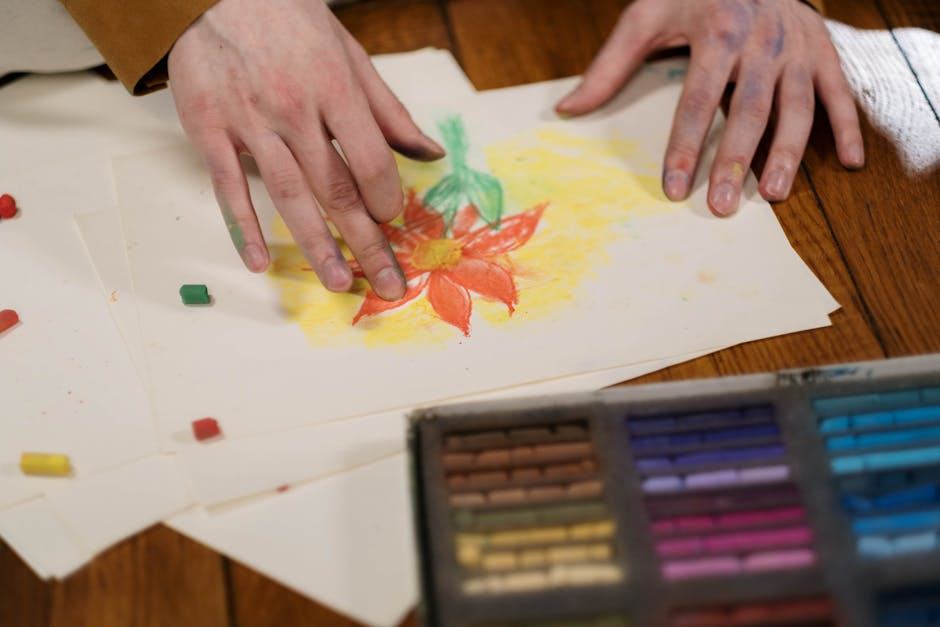
Unlock your creativity with our beginner's guide to pastel drawing! Discover vibrant techniques, essential supplies, and workspace tips to enhance your art. Learn blending, layering, and color theory to create stunning, textured artworks. Dive into the exciting world of pastels today!
Most people assume pastels are the beginner-friendly crayon cousin of "real" painting. Pick up a stick, smear it around, done. That assumption is why so many first pastel drawings end up as a muddy, overworked mess on the wrong paper.
Pastels are actually one of the most direct and unforgiving fine art media there is — no wet-dry waiting, no medium mixing, just pure pigment on a surface that either accepts it or doesn't. Once you understand how they actually work, the results are unlike anything else you can make.
Pastels are almost pure pigment held together with minimal binder — which is why the colors are so saturated and why the medium behaves nothing like pencil or paint. There are three technical realities that catch beginners off guard every time.
First: the surface does the work. Pastel has no liquid carrier to push it into paper fibers, so it needs a textured surface — called tooth — to physically grip the particles. Smooth paper sends it sliding right off.
Second: the tooth fills up fast. Every layer you apply occupies some of that texture. Once it's full, new pastel has nothing to grab onto and the surface becomes slick and unworkable. This is the hard ceiling that forces you to think ahead.
Third: blending is a trap. The instinct is to rub colors together until they look smooth. But heavy blending destroys texture and flattens everything into the same dead gray-middle. The best pastel work layers colors optically — letting them vibrate next to each other rather than merging into mush.
Your first session will probably be a still life or a simple landscape reference — something with clear shapes and obvious color areas. You'll lay down your first strokes and immediately notice how intense the color is. It feels almost too easy at first.
Then you'll try to fix something. You'll rub an area and either smear it beautifully or turn it gray. You'll add more color on top and notice the new layer sits differently than the first. By the time you're 20 minutes in, your fingers are completely coated in pigment.
The two things beginners almost universally get wrong: using too little pressure at first (then overcompensating), and treating the whole drawing surface the same. Pastel drawings need a light, open touch in the early layers to preserve tooth for later detail work.
The surprise most beginners report: how physical it is. You're using your fingers, your palm, the side of the stick, a paper stump. It feels more like sculpting than drawing. That tactile quality is either immediately addictive or immediately annoying — and it tells you a lot about whether this medium suits you.
Working pastelists almost never use white paper. This is the single most counterintuitive thing about the medium, and it's the insight that changes everything once it clicks.
Because pastel is opaque and you can't fully cover every bit of a surface, the paper color shows through everywhere — in the gaps between strokes, between layers, in blended areas. On white paper, those gaps read as harsh white holes that break the image apart. On a mid-tone paper — gray, tan, brown, or even deep blue — the gaps become part of the atmospheric tone of the whole piece.
The mid-tone paper also lets you work in both directions at once — adding light with pale pastels and adding shadow with darks — instead of building everything up from a white baseline. It cuts your work in half and makes values read more naturally from the start.
Warm subjects (portraits, autumn scenes, interiors) tend to sing on tan or ochre paper. Cool subjects (seascapes, night scenes, still water) come alive on gray or blue-gray. Choosing the right ground before you make a single mark is a decision that shapes every stroke that follows.
A Faber-Castell or Rembrandt student-grade soft pastel set (24–36 colors), a pad of Canson Mi-Teintes pastel paper, and a box of disposable gloves. This setup will get you through your first dozen sessions with no meaningful limitations.
Upgrade to Sennelier or Unison soft pastels (48+ colors), add a few sheets of UArt sanded paper, a set of pastel pencils for detail work, and a can of workable fixative. Sanded paper is a genuine step-change in what the surface lets you do.
A large professional set of Schmincke or Terry Ludwig pastels (72–100 colors), multiple sanded paper surfaces in different grits and tones, a dedicated pastel table or flat storage drawers, and a proper easel with a lip to catch falling dust. At this level you're also thinking about archival framing with UV-protective glass.
Soft pastels (24–36 color set) — the main event. Get soft, not oil pastels, which behave completely differently. | Canson Mi-Teintes paper pad — comes in multiple colors, has the right tooth, widely available. | Workable fixative spray — Lascaux or Krylon. Lets you add layers without disturbing what's already down. | Latex or nitrile gloves — optional but you'll want them. Pigment in your skin creases ruins details and, with some colors, takes days to wash out.
Sanded paper (UArt, Uart, Pastelmat) — noticeable difference but significantly pricier. Worth it once you've confirmed you like the medium. | Pastel pencils — great for fine lines and edges, but useless until you need that level of control. | Large professional sets — the color range matters less than understanding how to use what you have. | A pastel easel with a dust ledge — a basic tabletop easel works perfectly well for years.
Walk into any art supply store and you'll see three things labeled "pastels" that are actually completely different media. Picking the wrong one and deciding you hate pastels based on that experience is one of the most common beginner mistakes in visual art.
Soft pastels are what this guide is about — pure pigment, powdery, blendable, archival when framed properly. They're the standard fine art pastel.
Hard pastels have more binder and less pigment. They're firmer, better for initial sketching and underdrawing, and useful for sharp edges — but they lack the richness of soft pastels for finished work.
Oil pastels are waxy, don't dry, can't be easily layered with soft pastels, and have almost nothing in common with soft pastel technique. They're closer to encaustic painting than drawing. Buy them if you want them, but don't confuse them with what professionals mean when they say "pastels."
Start with soft pastels and maybe a small set of hard pastels for underdrawing. Leave oil pastels for a separate experiment later.
Pastel instruction ranges from genuinely excellent to "let's all smear things around while the instructor talks about feelings." Here's how to tell the difference before you pay:
The instructor talks about paper choice specifically. If the class description just says "pastel paper" without specifying tooth or color, that's a surface-level curriculum.
You can see the instructor's own finished work. Teaching pastel well requires actually working in pastel. Check their portfolio before you sign up.
The class covers value structure, not just blending technique. The single biggest cause of weak pastel work is poor value structure. A class that teaches you to blend without teaching you to see light and dark isn't teaching you to draw.
Supply lists are specific. Vague supply lists mean vague instruction. A good class tells you exactly what paper, what pastel brand tier, and what tools you need.
There's a demo component. Watching someone work in pastel in real time shows you how decisions happen, not just what the finished strokes look like.
Not sure where to start looking? Browse the full creative hobbies list for other related media and community resources.
The pastel community is smaller than the watercolor or acrylic crowds online, which actually makes it easier to get real feedback instead of just likes. r/Pastels on Reddit is the main hub — active, honest, and genuinely helpful for beginners.
On YouTube, Richard McKinley and Maggie Price have extensive free libraries covering technique at every level. For a more painterly approach, look up Albert Handell's instructional work. These aren't tutorial-mill channels — they're working artists explaining actual process.
The Pastel Society of America and the International Association of Pastel Societies (IAPS) both run juried shows, workshops, and regional chapter events. IAPS in particular runs a biennial convention that draws serious instructors from around the world — worth attending once you're a year or two in.
In person, local art centers and pastel guilds run open studio sessions where you work alongside other artists. These are worth more than most workshops because you see how other people solve problems in real time, not just in polished demos.
Give it 30 sessions before you decide. Here's what to look for at each stage:
Sessions 1–10: You're figuring out pressure, paper tooth, and how much blending is too much. Your work will look overworked. That's expected and irrelevant — the goal is just getting comfortable with the physical feel of the medium.
Sessions 10–20: You start deliberately choosing paper color. You catch yourself putting down fewer strokes and being more decisive about each one. At least one piece surprises you with how good a section of it looks.
Sessions 20–30: You develop preferences — certain paper surfaces, certain color relationships, certain subjects. You start leaving areas alone intentionally. The difference between what you're making now and your session-one work is visible and significant.
Stop if: the physical mess genuinely bothers you after 15 sessions and doesn't feel like part of the process. Pastel is a dusty, pigment-on-everything medium. That doesn't change.
Keep going if: you find yourself noticing color in a new way outside your sessions — looking at afternoon light on a wall and mentally reaching for which pastels you'd use to mix it.
Charcoal Drawing for Beginners — Pastel's closest relative in terms of surface and pressure; a useful parallel study.
Oil Painting for Beginners — If you're drawn to rich color and layering, oil painting shares pastel's approach to building luminosity.
Colored Pencil Art for Beginners — Shares the layering and blending logic of pastel but with far more control and no dust.
Watercolor Painting for Beginners — The other medium famous for unforgiving paper and surfaces that punish overworking.
Pencil Sketching for Beginners — A solid foundation in value and mark-making before you pick up your first pastel.
You'll need soft pastels, hard pastels for details, pastel paper with texture, blending tools like tortillons or brushes, and an eraser for corrections. A fixative spray helps preserve finished work and prevents smudging. These basics are affordable and widely available at art supply stores.
No, pastel drawing is beginner-friendly because results are immediate and forgiving. You can blend colors easily without special tools, and mistakes are simple to correct. Most beginners produce satisfying artwork within their first few sessions with basic technique guidance.
Basic techniques like blending and layering can be learned in 2–4 hours of practice. However, developing confident color mixing and composition skills typically takes 4–8 weeks of regular practice. Mastery is an ongoing journey, but functional skills develop quickly.
A starter kit with quality pastels, paper, and blending tools costs $25–$50. Budget brands work fine for learning, while professional-grade materials range from $75–$150. Paper is the biggest ongoing expense, but single sheets are inexpensive.
Soft pastels are highly pigmented and blendable, making them ideal for bold colors and textures. Hard pastels are better for details, outlines, and layering because they don't crumble as easily. Most artists use both types in the same artwork for maximum control.
Pastels produce fine dust, so a well-ventilated area or studio with a window is ideal. A simple easel, tabletop, or desk works fine—just protect your surface and wear an apron. Good lighting and a small trash bin for pastel scraps are helpful but not essential.