BoredomBusted — Find Your Next Favorite Thing To Do
Discover hobbies, activities, places, and ideas that spark joy. Whether you're looking for something creative, active, social, or relaxing, BoredomBusted helps you find your next favorite thing to do.
Browse our hobby guides, things-to-do collections, and place ideas to never be bored again.
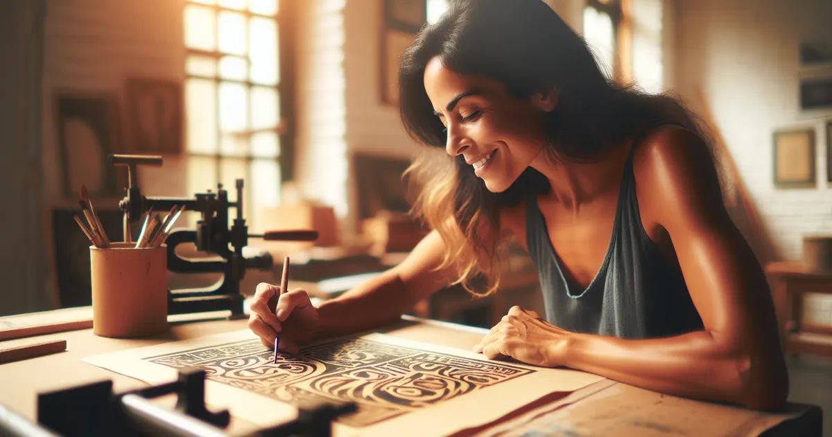
Calligram art isn't just about pretty shapes — it's a mental workout that forces your words and images to collide, creating powerful tension and deeper meaning.
Learning calligram art as a beginner opens up a unique way to create visual images using words and text – the letters become the picture.
Unlike hand lettering or illustration, the meaning of the words and the shape they create are designed to reinforce each other.
That dual layer is what separates it from decorative typography or doodling.
In calligram art, you select a shape, like a feather or heart, and choose corresponding words or phrases to meticulously arrange, filling the outline with text while adjusting letter size and spacing. This involves gripping a pen or brush, sketching a faint outline, and layering words to fit the shape, treating the process as a recreational puzzle that combines writing and visual art without the …
Calligram art induces a flow state by engaging your focus through the precise demands of word arrangement and shape-fitting, allowing you to lose track of time. It creates instant skill feedback as you adjust based on visual mismatches, fostering a sense of accomplishment and encouraging creative expression with each completed silhouette, while also promoting social belonging through sharing your…
You think calligram art is fancy doodling. Words arranged into a shape – cute, maybe impressive at a party, ultimately decorative.
But that's missing the real point.
Constraints are the game. You're not just placing words – you're making language and image convey the same meaning.
Calligrams train spatial-linguistic thinking** – the cognitive muscle used in design and typography.
The impact comes from text-shape tension** – agreement becomes decoration, conflict becomes art.
Picture this: a calligram of a gun, crafted entirely from text of a peace treaty. The shape signals violence. The text calls for peace. Neither reads the same after you see them clash on the page.
That tension isn't about clean lines or perfect handwriting.
Conflict drives impact. The next section dives into the choices that build it.
Creating art with letters can seem like sleight of hand at first. Watching a lion's mane form from the word "wild" makes it look deceptively simple.
Most beginners think they can replicate it immediately, but that's not the case. The learning curve is smaller than it appears and becomes easier once you grasp the hidden challenges.
Your first drafts will be messy. Expect your desk to be covered in pencil grids. The sense of relaxation turns to determination as you untangle the complexities.
It feels more like geometry than art at first, taking longer than planned. Not quite drawing or lettering, it's a discipline of syncing two systems.
Start by tracing your shape boundary, then plan text density. Most beginners try to freehand it and run out of space, leading to do-overs.
Next, let's explore common missteps that keep early-stage efforts frustrating longer than they need to be.
When to start: Early morning
Duration: 1 hour
Cost to try: $5
Success criteria: If you finish a calligram with a clear silhouette and fully inked words that form a recognizable image, do session 2.
It's tempting to picture a shape and go straight to ink, only to find your word runs out of letters before the shape is done.
Sketch lightly in pencil first, count your characters, and assign each one a zone before committing to ink.
Uniform lettering looks tidy alone. But when the shape needs curves and tapers, it breaks the illusion.
Scale individual letters up or down to match the contour, seeing size as a shaping tool, not a rigid rule.
A wolf howling sounds great, until the jagged spaces wreck your letter spacing.
Begin with a simple shape with one dominant curve, like a circle or crescent, to give the letters a logical path.
Newbies focus on where the text fits and ignore the empty inside, leaving it accidental instead of intentional.
Design two or three intentional gaps in your lettering to let the shape breathe. Remember, blank space is part of the art, not a gap to fill.
Ink on paper feels permanent. But when the second line drifts, your plan unravels. This rush to ink is the quickest way to ruin a promising design.
Craft a complete pencil draft at the actual size. Once satisfied, trace positions and ink over it using a lightbox or a bright window.
Calligram art thrives at your own table. Good lighting and nearby art supplies complete the setup.
No single national body focuses solely on calligram art. IAMPETH is your best bet for authoritative resources.
When joining a group, mention your general lettering skills but newness to calligrams. It saves time and ensures the right fit for workshops.
Shape words to sculpt a human face. Choose text tied to the person, like quotes or poetry.
Technically demanding but rewarding. Tiny mistakes create off facial contours. Perfect for those comfortable with basic shape creation.
Use one repeated phrase to fill shapes like a heart or tree. A forgiving start.
Beginners can dive right in without special tools. Just grab a pencil, paper, and an outline to trace.
Use Illustrator or Canva for calligrams, leveraging type-on-a-path and text warp tools.
Precision over a handmade feel. Software offers a different touch if handwriting isn't your strong suit.
Blend different scripts within shapes, like Arabic with English, for visual tension.
Only attempt if scripts contrast distinctly. Perfect for those who cherish multiple languages.
Write words so they form paths mimicking the subject. Rain falls downward, spirals spiral.
More poetry than art. Ideal for writers adding a visual twist without delving into drawing.
A close neighbor worth considering: Doll Making.
Another variant that pulls from the same roots is Home Decor Styling.
If this resonates, Monotype Printing explores a similar direction.
Visual weight mapping is the centerpiece of impactful calligrams. It isn't just about controlling your pen or perfecting fonts.
Mastering this transforms decoration into design. You start by mentally assigning weight to each section of a shape before picking up the pen. Only then can you control how text interacts with its boundary.
Learn to read a shape's tonal structure beforehand. If you can, your letters build the shape, not just fill it. It's the shift from stuffing words into outlines to letting them define their own space. The silhouette naturally emerges from the text itself.
This is where amateurs and attention-grabbing artwork diverge. Once you grasp this, your calligrams will make the viewer stop and look.
Six sessions across 30 days, each lasting about an hour, are perfect. Complete a full calligram in each session to see if it genuinely interests you.
Calligrams require tackling two challenges: lettering and composition. First sessions let you get comfortable with lettering. The following ones show whether creating compositions feels rewarding or merely frustrating.
If you find yourself revisitng your creations just to observe them, you're onto something. Calligram enthusiasts take pride in their completed work. Start a small portfolio and focus on a particular theme for the next month.
Finished all six sessions but felt no connection? That's a genuine outcome. When text restrictions feel suffocating rather than stimulating, the issue might be the constraint itself. Extending the trial by a month might help, but more than that likely won't change the outcome.
If working on a calligram became a dreaded chore, accept this as honest information. This hobby favors those who find restrictions exciting. Annoyance during practice suggests it's might not be your best creative outlet.
You're checking out lettering-shaped doodles in margins, on napkins, or around drawings. This unconscious habit signals a natural fit for calligram art. It may be thrilling to channel this into more structured creations.
Still looking for something to do? Browse things to do when bored for more ideas.
You'll need basic materials like fine-tipped markers, pens, or brushes, paper, and a pencil for sketching your outline. For digital calligrams, design software like Canva, Adobe Illustrator, or even free tools like GIMP work well. Most beginners start with physical materials since they're affordable and require no technical setup.
A simple calligram can take 30 minutes to an hour, while more intricate designs may take 2–4 hours depending on size and detail level. Your speed improves significantly with practice as you become faster at planning compositions and executing letterforms.
It's surprisingly accessible for beginners since you don't need advanced artistic skills—just patience and basic handwriting ability. Start with simple shapes and short words, then progress to complex designs as you gain confidence with spacing and letter sizing.
Calligraphy focuses on beautiful, decorative letterforms, while calligrams arrange words into visual shapes that reinforce the meaning of the text itself. In a calligram, the physical arrangement and outline of the letters are just as important as the words they spell.
Both approaches work equally well—digital creation gives you precision and easy editing, while handmade calligrams offer organic texture and personal character. Many artists switch between both methods depending on the project or their preference.
You can begin for under $20 with basic markers and printer paper from any store. If you want premium supplies like quality brush pens or specialty paper, budget $30–$50, and digital creation requires only free software or a one-time purchase of design tools.